Add Regression Line to ggplot2 Plot in R
Last Updated :
28 Apr, 2021
Regression models a target prediction value based on independent variables. It is mostly used for finding out the relationship between variables and forecasting. Different regression models differ based on – the kind of relationship between dependent and independent variables, they are considering and the number of independent variables being used.
The best way of understanding things is to visualize, we can visualize regression by plotting regression lines in our dataset. In most cases, we use a scatter plot to represent our dataset and draw a regression line to visualize how regression is working.
Approach:
In R Programming Language it is easy to visualize things. The approach towards plotting the regression line includes the following steps:-
- Create the dataset to plot the data points
- Use the ggplot2 library to plot the data points using the ggplot() function
- Use geom_point() function to plot the dataset in a scatter plot
- Use any of the smoothening functions to draw a regression line over the dataset which includes the usage of lm() function to calculate intercept and slope of the line. Various smoothening functions are show below.
Method 1: Using stat_smooth()
In R we can use the stat_smooth() function to smoothen the visualization.
Syntax: stat_smooth(method=”method_name”, formula=fromula_to_be_used, geom=’method name’)
Parameters:
- method: It is the smoothing method (function) to use for smoothing the line
- formula: It is the formula to use in the smoothing function
- geom: It is the geometric object to use display the data
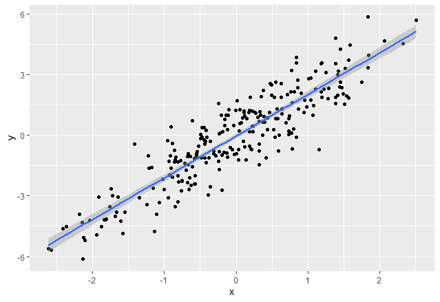
In order to show regression line on the graphical medium with help of stat_smooth() function, we pass a method as “lm”, the formula used as y ~ x. and geom as ‘smooth’
R
rm(list = ls())
set.seed(87)
x <- rnorm(250)
y <- rnorm(250) + 2 *x
data <- data.frame(x, y)
head(data)
library("ggplot2")
ggp <- ggplot(data, aes(x, y)) +
geom_point()
ggp
ggp +
stat_smooth(method = "lm",
formula = y ~ x,
geom = "smooth")
|
Output:
Method 2: Using geom_smooth()
In R we can use the geom_smooth() function to represent a regression line and smoothen the visualization.
Syntax: geom_smooth(method=”method_name”, formula=fromula_to_be_used)
Parameters:
- method: It is the smoothing method (function) to use for smoothing the line
- formula: It is the formula to use in the smoothing function
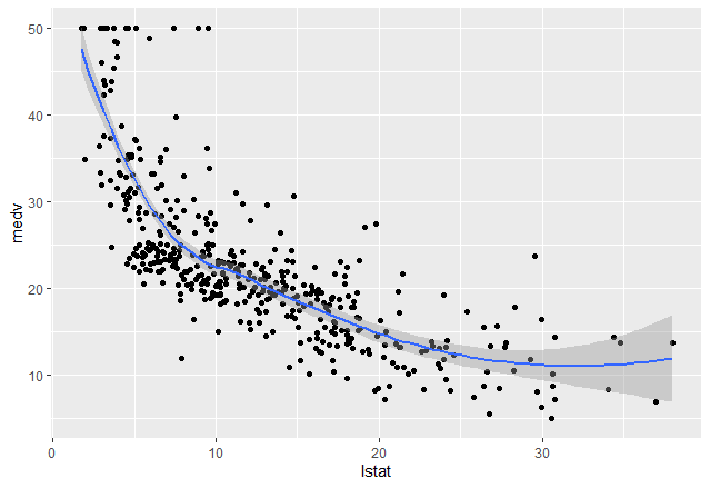
In this example, we are using the Boston dataset that contains data on housing prices from a package named MASS. In order to show the regression line on the graphical medium with help of geom_smooth() function, we pass the method as “loess” and the formula used as y ~ x.
R
library(dplyr)
data("Boston", package = "MASS")
training.samples <- Boston$medv %>%
createDataPartition(p = 0.85, list = FALSE)
train.data <- Boston[training.samples, ]
test.data <- Boston[-training.samples, ]
ggp<-ggplot(train.data, aes(lstat, medv) ) +
geom_point()
ggp+geom_smooth(method = "loess",
formula = y ~ x)
|
Output:
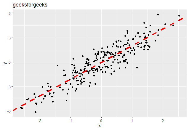
Method 3: Using geom_abline()
We can create the regression line using geom_abline() function. It uses the coefficient and intercepts which are calculated by applying the linear regression using lm() function.
Syntax: geom_abline(intercept, slope, linetype, color, size)
Parameters:
- intercept: The calculated y intercept of the line to be drawn
- slope: Slope of the line to be drawn
- linetype: Specifies the type of the line to be drawn
- color: Color of the lone to be drawn
- size: Indicates the size of the line
The intercept and slope can be easily calculated by the lm() function which is used for linear regression followed by coefficients().
R
rm(list = ls())
library("ggplot2")
set.seed(87)
x <- rnorm(250)
y <- rnorm(250) + 2 *x
data <- data.frame(x, y)
reg<-lm(formula = y ~ x,
data=data)
coeff<-coefficients(reg)
intercept<-coeff[1]
slope<- coeff[2]
ggp <- ggplot(data, aes(x, y)) +
geom_point()
ggp+geom_abline(intercept = intercept, slope = slope, color="red",
linetype="dashed", size=1.5)+
ggtitle("geeksforgeeks")
|
Output:
Like Article
Suggest improvement
Share your thoughts in the comments
Please Login to comment...