Add line for average per group using ggplot2 package in R
Last Updated :
03 Dec, 2021
In this article, we will discuss how to add a line for average per group in a scatter plot in the R Programming Language.
In the R Language, we can do so by creating a mean vector by using the group_by() and summarise() function. Then we can use that mean vector along with the geom_hline() function of the ggplot2 package to create a line by the mean point colored by the group.
To create a mean vector from the data frame,
Syntax:
mean <- df %>%
group_by( <categorical-variable> ) %>%
summarise( mean_val = mean( <quantitative-variable> )
Arguments:
- df: determines the data frame to be used.
- <categorical-variable>: determines the variable that is used to divide data into groups.
- <quantitative-variable>: determines the variable whose mean is to be found.
This expression creates a vector with two columns i.e. <categorical-variable> and the mean that stores mean by category. Now, we will use this mean vector with the geom_hline() function to add a horizontal line at the mean/average of data colored by categorical variable.
Syntax:
plot + geom_hline( mean_df, aes( yintercept, col )
Arguments:
- mean_df: determines the data frame that contains mean information.
- yintercept: determines the variable mean column in dataframe.
- col: determines the categorical variable by which line has to be colored.
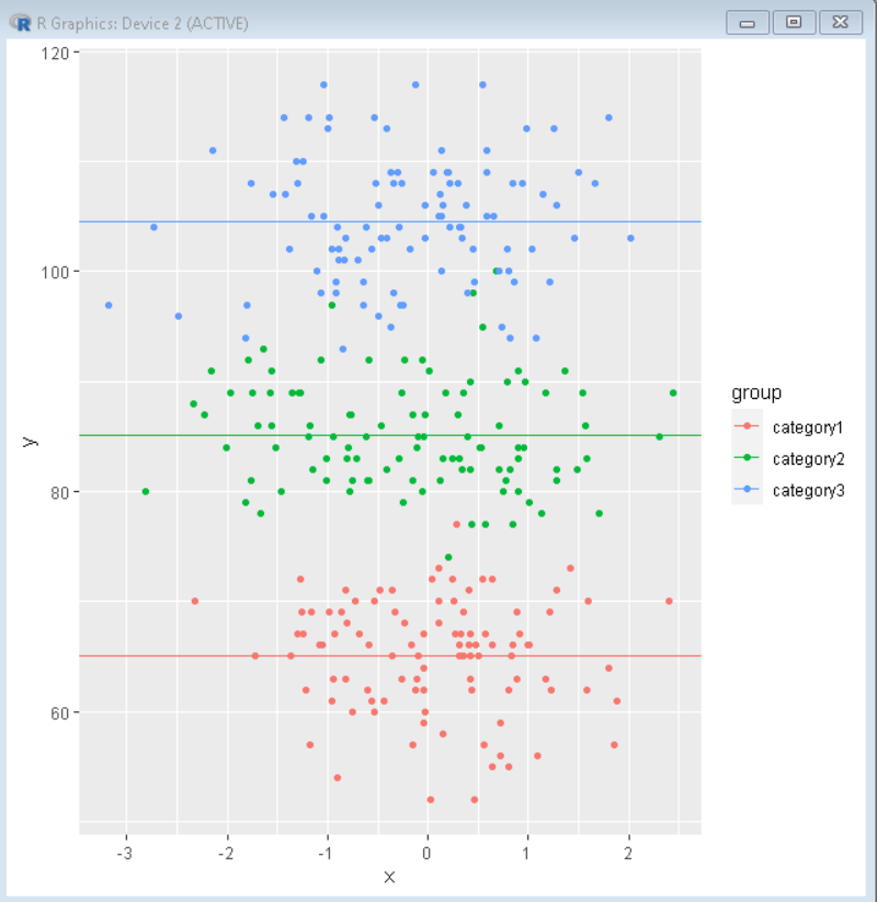
Example 1:
Here in this example, we have created a scatter plot colored by a categorical variable. Then we have added a line colored by the same variable that goes through the mean of that category of data.
R
library(tidyverse)
df <- data.frame(
group=factor(rep(c("category1", "category2","category3"),
each=100)),
y=round(c(rnorm(100, mean=65, sd=5),
rnorm(100, mean=85, sd=5),
rnorm(100, mean=105, sd=5))),
x=rnorm(300))
mean <- df%>% group_by(group)%>%summarise(mean_val=mean(y))
ggplot(data = df, aes(x= x, y=y)) +
geom_point(aes(colour = group)) +
geom_hline(data= mean, aes(yintercept = mean_val,col=group))
|
Output:
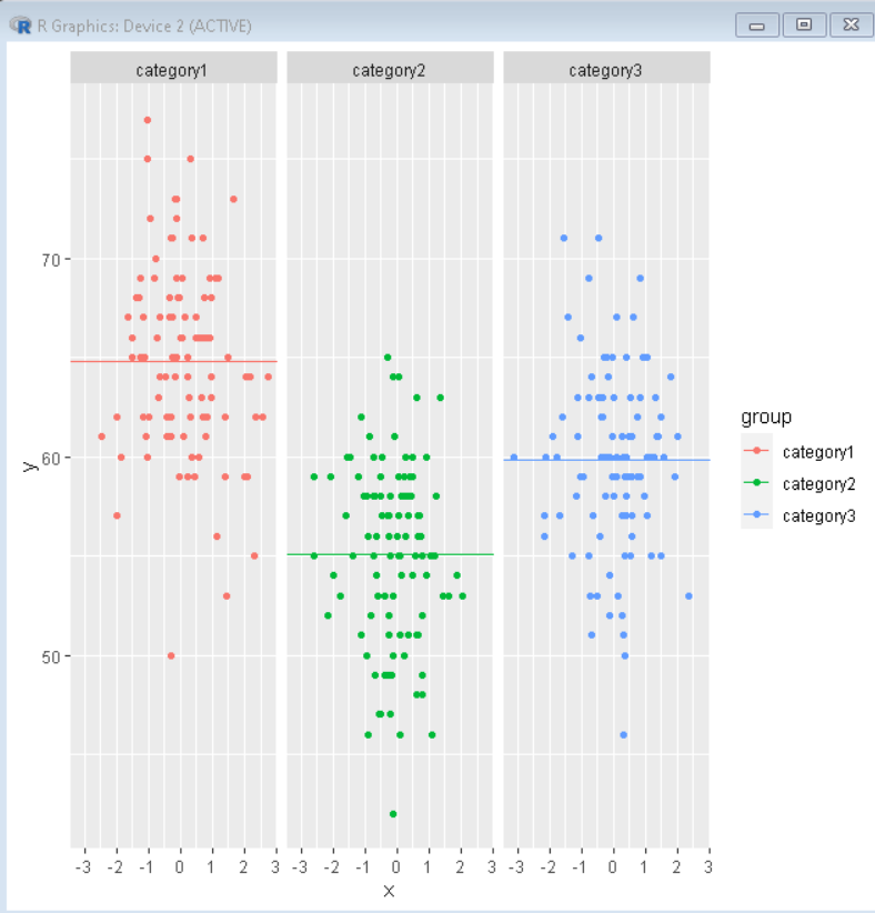
Example 2:
In this example, we have created a scatter plot colored by a categorical variable. Then we have added a line colored by the same variable that goes through the mean of that category of data. We have also added a facet_grid() to convert this plot into a facet plot to better visualize the data through a categorical variable.
R
library(tidyverse)
df <- data.frame(
group=factor(rep(c("category1", "category2","category3"),
each=100)),
y=round(c(rnorm(100, mean=65, sd=5),
rnorm(100, mean=55, sd=5),
rnorm(100, mean=60, sd=5))),
x=rnorm(300))
mean <- df%>% group_by(group)%>%summarise(mean_val=mean(y))
ggplot(data = df, aes(x= x, y=y)) +
geom_point(aes(colour = group)) +
geom_hline(data= mean, aes(yintercept = mean_val,col=group))+
facet_grid(~group)
|
Output:
Share your thoughts in the comments
Please Login to comment...