Add legends without border and with white background in R
Last Updated :
21 Apr, 2021
A legend is defined as an area of the graph plot describing each of the parts of the plot. The legend plot is used to show statistical data in graphical form. We can add a legend to a graph using the legend() function. In this article, we will see how to add plot legends without border and with white background in R Programming Language.
By Default legend() function generate legend with the border as we will see further. Firstly, let’s just create a normal bar graph without any legend.
Syntax: barplot(H, xlab, ylab, main, names.arg, col)
Parameters:
- H: This parameter is a vector or matrix containing numeric values which are used in bar chart.
- xlab: This parameter is the label for x axis in bar chart.
- ylab: This parameter is the label for y axis in bar chart.
- main: This parameter is the title of the bar chart.
- names.arg: This parameter is a vector of names appearing under each bar in bar chart.
- col: This parameter is used to give colors to the bars in the graph.
Example:
R
colors = c("green", "orange", "brown")
months <- c("Mar", "Apr", "May", "Jun", "Jul")
Values <- matrix(c(2, 9, 3, 11, 9, 4, 8, 7, 3, 12,
5, 2, 8, 10, 11),
nrow = 3, ncol = 5, byrow = TRUE)
barplot(Values, main = "Total Revenue", names.arg = months,
xlab = "Month", ylab = "Revenue",
col = colors, beside = TRUE)
|
Output:
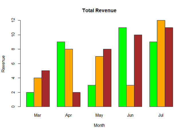
Simple BarChart
Now we add legends to the above graph using legend() function.
Syntax : legend(x, y, legend, fill, col, bg, lty, cex, title, text.font, bg)
Parameters :
- x and y : co-ordinates to be used to position the legend
- legend : Text of the legend
- fill : Colors to be used to fill the boxes of legend
- col : Colors of lines
- bg : It defines background color for the legend box. (optional)
- title : Legend title (optional)
- text.font : An integer specifying the font style of the legend (optional)
Return : Legend of Plot
Example:
R
colors = c("green", "orange", "brown")
months <- c("Mar", "Apr", "May", "Jun", "Jul")
regions <- c("East", "West", "North")
Values <- matrix(c(2, 9, 3, 11, 9, 4, 8, 7, 3, 12,
5, 2, 8, 10, 11),
nrow = 3, ncol = 5, byrow = TRUE)
barplot(Values, main = "Total Revenue", names.arg = months,
xlab = "Month", ylab = "Revenue",
col = colors, beside = TRUE)
legend(1,12, regions, cex = 1.0, fill = colors)
|
Output:
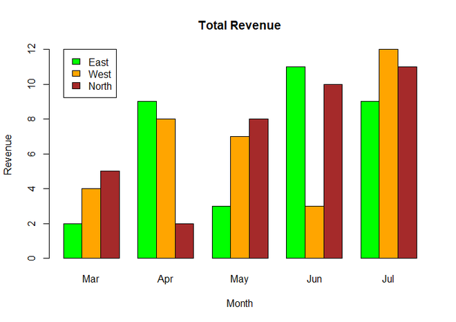
BarChart with legend
You can see in the above output graph, the legend was in black border. Now we will remove the border and add white background to the plot using box.col parameter inside legend() function and set its value to white for white background.
Example:
R
colors = c("green", "orange", "brown")
months <- c("Mar", "Apr", "May", "Jun", "Jul")
regions <- c("East", "West", "North")
Values <- matrix(c(2, 9, 3, 11, 9, 4, 8, 7, 3, 12,
5, 2, 8, 10, 11),
nrow = 3, ncol = 5, byrow = TRUE)
barplot(Values, main = "Total Revenue", names.arg = months,
xlab = "Month", ylab = "Revenue",
col = colors, beside = TRUE)
legend(1,12, regions, cex = 1.0, fill = colors, box.col = "white")
|
Output:

Plot Legends without border and with white background
Like Article
Suggest improvement
Share your thoughts in the comments
Please Login to comment...