How to Add Google Charts on a Webpage?
Last Updated :
21 Oct, 2021
What is a pie chart?
A pie chart (or a circle chart) is a circular statistical graphic which is divided into slices to illustrate numerical proportion. In a pie chart, the arc length of each slice (and consequently its central angle and area), is proportional to the quantity it represents. While it is named for its resemblance to a pie which has been sliced, there are variations on the way it can be presented.
Applications of Pie chart
- Pie charts are generally used to show percentage or proportional data of sales of different items in a business.
- Used in elections to show percentage of votes each party has received.
- Used in surveys to depict no of items in each category.
- Broadly used in database and excel sheets.
Follow the steps to add a google pie chart on a webpage:
Step 1 : Start with a simple basic web page.
Add a “div” element with the id “piechart”:

Step 2 : Adding a reference
Add a reference to the Chart API at google.com.

Step 3 : Add a JavaScript function
Explanation : The below code is used to load Google charts :

The below code is used to draw a chart and set the user specific values for each division :
The code below is used to display the chart inside the “div” element with id=”piechart” :

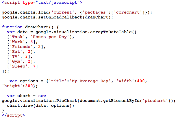
INPUT :
<!DOCTYPE html>
<html lang="en-US">
<body>
<h1>Time Allotment of a day</h1>
<div id="piechart"></div>
<script type="text/javascript"
<script type="text/javascript">
google.charts.load('current', {'packages':['corechart']});
google.charts.setOnLoadCallback(drawChart);
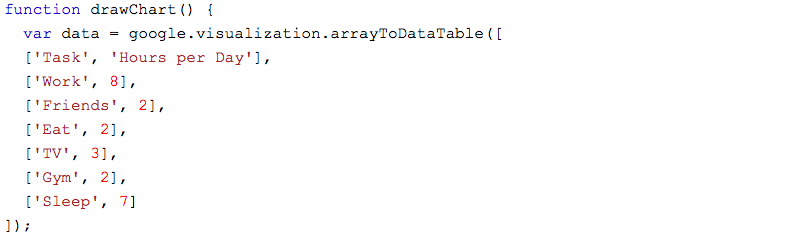
function drawChart() {
var data = google.visualization.arrayToDataTable([
['Task', 'Hours per Day'],
['Work', 8],
['Eat', 2],
['TV', 4],
['Gym', 2],
['Sleep', 8]
]);
var options = {'title':'My Average Day', 'width':550, 'height':400};
var chart =
new google.visualization.PieChart(document.getElementById('piechart'));
chart.draw(data, options);
}
</script>
</body>
</html>
|
OUTPUT :
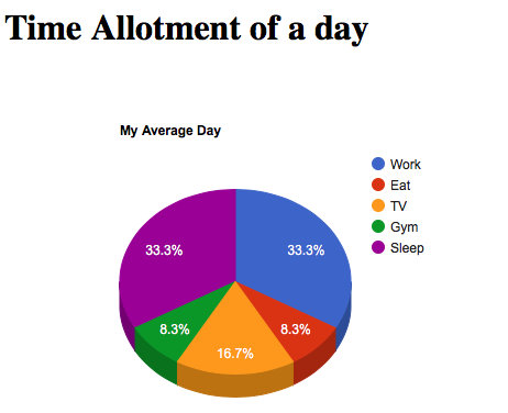
To get a 3d pie chart, set “is3d” option to true :

INPUT :
<!DOCTYPE html>
<html lang="en-US">
<body>
<h1>Time Allotment of a day</h1>
<div id="piechart"></div>
<script type="text/javascript"
<script type="text/javascript">
google.charts.load('current', {'packages':['corechart']});
google.charts.setOnLoadCallback(drawChart);
function drawChart() {
var data = google.visualization.arrayToDataTable([
['Task', 'Hours per Day'],
['Work', 8],
['Eat', 2],
['TV', 4],
['Gym', 2],
['Sleep', 8]
]);
var options =
{'title':'My Average Day', 'width':550,'height':400,is3D: true};
var chart =
new google.visualization.PieChart(document.getElementById('piechart'));
chart.draw(data, options);
}
</script>
</body>
</html>
|
OUTPUT :
Like Article
Suggest improvement
Share your thoughts in the comments
Please Login to comment...