Add a border around histogram bars in Matplotlib
Last Updated :
24 Jan, 2021
Prerequisites: Matplotlib
In this article, we will see how can we can add a border around histogram bars in our graph using matplotlib, Here we will take two different examples to showcase our graph.
Approach:
- Import required module.
- Create data.
- Add border around histogram bars.
- Normally plot the data.
- Display plot.
Below is the Implementation:
Example 1:
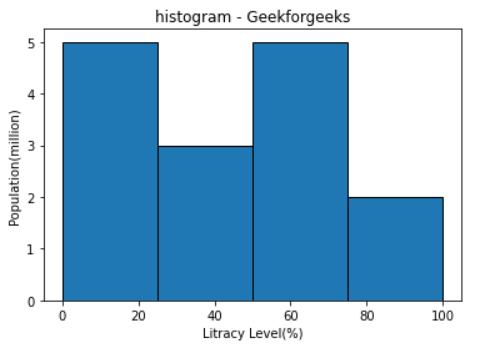
In this example, we will Pass an edgecolor = ‘Black’ value as the edge color parameter to plt.hist() to change the bar border color.
Python3
from matplotlib import pyplot as plt
import numpy as np
fig,ax = plt.subplots(1,1)
a = np.array([22, 87, 5, 43, 56, 73, 55,
54, 11, 20, 51, 5, 79, 31, 27])
b = (0, 25, 50, 75, 100)
ax.hist(a, b, edgecolor = "black")
ax.set_title("histogram - Geekforgeeks")
ax.set_xlabel('Litracy Level(%)')
ax.set_ylabel('Population(million)')
plt.show()
|
Output:
Example 2:
In this example, we will Pass a two edge color, edgecolor = ‘Black’ and ‘red’ value as the edge color parameter to plt.hist() to change the bar border color.
Python3
from matplotlib import pyplot as plt
import numpy as np
fig,ax = plt.subplots(1, 1)
a = np.array([20, 73, 55, 31, 51, 5, 79, 5,
43, 22, 87, 54, 11, 56, 27])
b = np.array([0, 25, 50, 75, 100])
ax.hist(a, edgecolor = "black", color = 'pink')
ax.hist(b, edgecolor = "red", color = 'gray')
ax.set_title("Histogram - Geekforgeeks")
plt.show()
|
Output:
Like Article
Suggest improvement
Share your thoughts in the comments
Please Login to comment...