Suppose you have data and you need to demonstrate the different trends in that data to other people. What’s the best method of doing so? A data visualization of course! You can use various types of charts depending on your data and the conclusions you want to convey. In fact, charts are a very important part of data visualization. Creating a chart from data is the first step in creating a data story that could inform people and even change their minds! And Tableau has all the charts you could imagine for Data Visualization and more!

These charts are intuitive and easy to create while providing quick information about the data to viewers. So let’s see the different types of charts in Tableau.
1. Bar Chart
A Bar chart organizes the data into rectangular bars that can easily be used to compare data sets. You can create a bar chart if you want to compare two or more data values of a similar kind and if you don’t have too many data groups to display. However, bar charts show discrete data so it might not be a good idea to use them if you want continuous data.
You can create a bar chart in Tableau using the Show Me option. A bar chart requires 0 or more dimensions and 1 or more measures. In Tableau, dimensions are fields that cannot be aggregated like Customer ID, Customer Names, etc. while measures are fields that can be measured or aggregated like profit, sales, etc. In the below screenshot, we have created a bar chart to show the Sum of sales for different Customer Segments.

2. Line Chart
A-Line Chart visualizes data in the form of a line that is very useful in understanding trends and patterns. It’s best to use the Line Chart if you want to show data relative to a continuous variable like time. Different colored lines for different variables in the data make it very easy to understand a line chart.
You can create a Line Chart in Tableau using the Show Me option. A-Line Chart requires 0 or more dimensions and 1 or more measures. In the below screenshot, we have created a Line Chart to show the Sum of sales for different Customer Segments.

3. Area Chart
An Area Chart is similar to a Line Chart in that it also visualizes the data in the form of a line that is very useful in understanding trends and patterns. However, the area under the line in an area chart is also colored. This can be used with multiple variables in the data to demonstrate the relative differences between the variables.
You can create an Area Chart in Tableau using the Show Me option. An Area Chart requires 0 or more dimensions and 1 or more measures. In the below screenshot, we have created an Area Chart to show the Average CO2 emissions for the years ranging from 2001 to 2009.

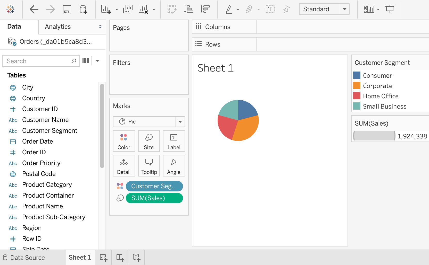
4. Pie Chart
A Pie chart is the best option if you want to compare some parts of the whole in the data. It can easily give an idea of the number of different parts on the whole but a disadvantage is that a pie chart is not very precise unless you add numerical values to each part of the pie chart representing the individual share on the whole.
You can create a Pie chart in Tableau using the Show Me option. A Pie chart requires 1 or more dimensions and 1 or 2 measures. In the below screenshot, we have created a Pie Chart that demonstrates the Sum of sales for different Customer Segments. The Customer Segments are demonstrated using different colors while the Sum of sales forms the pie slices in the Pie Chart.
5. Treemap
A Treemap is used to demonstrate different parts of the data as they relate to the whole. Each rectangle in a Treemap is divided into smaller rectangles based on its proportions to the whole data like branches of a tree. So the total Treemap demonstrates the whole data while individual rectangles show the sub-data in proportion to the whole.
You can create a Treemap in Tableau using the Show Me option. A Treemap requires 1 or more dimensions and 1 or 2 measures. In the below screenshot, we have created a Treemap to show the number of products ordered for different Customer Segments. The more the number of products for a Customer Segment, the larger its rectangle in the Treemap.

6. Scatter Plot
Scatterplots are used to understand the relationship between two variables in the data. You can also find the outliers in your data or understand the overall distribution by plotting a scatterplot. If the data moves from lower left to upper right, there might be a positive correlation between the two variables if the data move in the opposite direction, there might be a negative correlation.
You can create a Scatterplot in Tableau using the Show Me option. A Scatterplot requires 0 or more dimensions and 2 to 4 measures. In the below screenshot, we have created a Scatterplot to show the Sum of profits acquired for the Sum of sales for different Customer Segments.

7. Bubble Chart
A bubble chart can be used to show the relationships between different measures and dimensions. While a bubble chart is not a full-fledged visualization on its own, it can be used along with other types of charts to add more details. The size and color of the bubbles in a bubble chart denotes various characteristics of the data in the visualization.
You can create a bubble chart in Tableau using the Show Me option. A Scatterplot requires 1 or more dimensions and 1or 2 measures. In the below screenshot, we have created a bubble chart that demonstrates the Sum of sales for various Customer segments. Each of the bubble colors denotes the different Customer segments while the size of the bubble indicates the Sum of sales.

8. Symbol Map
A Symbol Map visualizes the data on top of a map of a geographical location. It is best to use this map if the data has geography as an important part with different bubble or any other symbol demonstrating data meaning on the map.
You can create a Symbol Map in Tableau using the Show Me option. A Symbol Map requires a geographical dimension, 0 or more dimensions, and 0 to 2 measures. In the below screenshot, we have created a Symbol Map that demonstrates the Average CO2 emissions in different countries of the world. The size of the bubble indicates the Average CO2 emissions with a larger bubble meaning more emissions.

9. Density Map
A Density Map visualizes the data on top of a map of a geographical location. It is best to use this map if the data has geography as an important part with different shades of the same color representing different data meanings on the map. However, if you want to show precise points of data, then a Density Map is not the best idea.
A Density Map is represented by Maps in Tableau and you can create one using the Show Me option. A Density Map requires a geographical dimension, 0 or more dimensions, and 0 or 1 measures. In the below screenshot, we have created a Density Map that demonstrates the Average CO2 emissions in different countries of the world. The color of the country indicates the Average CO2 emissions with a darker color meaning more emissions.

10. Heat Map
A Heat map provides the relationship between two variables in the data along with rating information between these variables. This rating information is normally displayed using various parameters such as shades of the same color, increasing or decreasing size, etc.
You can create a Heat map in Tableau using the Show Me option. A Heat map requires 1 or more dimensions and 1 or 2 measures. In the below screenshot, we have created a Heat map that demonstrates the Average CO2 emissions in different regions of the world across the years 2000 to 2010. The size of the squares indicates the Average CO2 emissions with a larger size meaning more emissions.

All in all, these are some of the most important types of charts in Tableau. You can create most of your visualizations using these charts as they are easy to use and also familiar to the audiences. You can select the specific type of chart you want to use based on your data and the insights you wish to convey. For example, a line chart is best to display data that changes with time while a density map is optimal for geographical data. So it’s important to understand your data and then choose one of these charts to create the visualization you want!
Like Article
Suggest improvement
Share your thoughts in the comments
Please Login to comment...